Analysing results
When running experiments, Accio generates a lot of information. Thankfully, it comes with tools to help you visualize and analyse all this data.
Visualizing results with the Web UI
The simplest tool to get insights into results of any run is the Web interface, accessible through the gateway. For each successfully completed node, it provides you a view over the artifacts and metrics that were generated. Some artifact types come with a custom visualization. For example, collections of numeric or pseudo-numeric types (i.e., distance and duration) are displayed as plots.
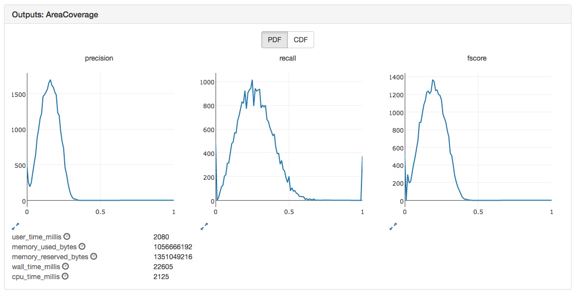
The above image shows the output of an AreaCoverage node.
On top, there are three plots, one for each node output.
Each output is a map (keys are strings, values are doubles), which allows it to be displayed as a plot.
Plots can be enlarged, zoomed and event exported as images.
They can be viewed either as a probability density function (PDF) or a cumulative distribution function (CDF).
Below these plots is the list of metrics generated by the node, identified with the small gauge symbol after their name.
All metrics are double valued.
Exporting data in CSV with the CLI
While the Web UI is a very practical tool to have a quick bird view over the results, most of the time we need to analyse at a finer grain.
This is what the accio export command is made for.
Its goal is to translate raw results provided by runs into a collection of well-organized CSV files.
It will generate one CSV file per artifact or metric, and can be used to aggregate information coming from many runs.
These CSV files can then be easily digested by desktop applications such as Microsoft Excel, as well as many programming languages.